
We used to think that it was only humans who used symbols to represent things thereby making it easier to communicate to their peers. This is no longer the case, as we are clear that other species do so too. The fields of informatics and visual graphics are booming these days, in part because of the plethora of data that is readily available, and in part due to the ever increasing sophistication of the apparatus to create and present these symbols.
One of the pioneers, in recent times, of visual graphics was Donis A Dondis, whose book “A primer of visual literacy” was published in 1974. However, he built on a solid body of knowledge that was already highly refined and sophisticated in the days of Leonardo da Vinci. To give an impression of the extraordinary repertoire of visual models available to us, Lengler and Eppler in 2007, produced a ‘periodic table’ of visualisation methods for management. Please check out the Visual Literacy e-learning site (www.visual-literacy.org) for some fascinating materials, but especially take a look at their periodic table (http://www.visual-literacy.org/periodic_table/periodic_table.html).
This is not intended as an article on visual methods.
It is intended as a reminder that these models are precisely that – models. The diagrams, metaphors, and acronyms, used in this way are simple representations of a complex situation. If the situation was simple it wouldn’t need such a diagram or other model. Simplifying something into a form that can be communicated has to be done carefully. If we over-simplify there’s a danger that people won’t understand important sophistications and complexities. Worse still, the creators of some of these representations can become so passionate about the insights that they have gained by reducing the complexity to a simplicity that they lose sight of the simplification and instead speak in terms of the model rather than the real world. In their enthusiasm, they present this to other people. If these others have some expertise in the field, they may understand that this is simply a model, but if they are not there’s a very real danger that they buy into the model and don’t understand its purely theoretical nature.
Given the extraordinary range of possibilities demonstrated in the periodic table above, it is surprising how many corporate executives stick to very simple approaches. I want to illustrate this problem with some home-brewed examples.
Firstly, I’d like to use a metaphor for the nature of engagement at work. Engagement at work is an important contemporary concern of HR professionals. Back in the 1970s, an OD consultant, Mike Robson, likened engagement to the behaviour of iron filings on a sheet of paper. If you poured the filings out of a jar, then they would fall all over the place in random directions. If you then ran a magnet beneath the paper, all the filings would align with one another. They were pointing towards a common goal – they were ‘engaged’. It’s a nice image, great for sweeping gestures on TV, but the idea that employees are no more sophisticated than a jar of iron filings is a little derogatory and the idea that their leaders simply have to rub a magic wand (or at least a magnet) to achieve this result is insulting.
To get a set of related concepts across in a simple manner, that can be memorised, we often use an acronym. The acronym is not important, it is the underlying concepts that are important. Two people can use different acronyms to get the same things across. In the world of ‘advanced driving’, we are told that it is important to perform certain checks on our vehicle before we drive it. One person might remember this as POWER (Petrol, Oil, Water, Electrics and Rubber). Another might prefer FLOWER (Fuel, Lights, Oils, Water, Electrics, and Rubber). And a third might use FLEA-BITES (Fuel, Lights, Engine oil, Air, Beep, Indicators, Tyres, Emergency kit and Spray). The acronym is only a tool to improve memory; it has no mystical qualities.
Suppose we want to convey something that doesn’t conveniently fit an acronym, or perhaps has an important sequence? One approach is to use a sentence – albeit contrived – as people will be able to remember the sentence and then fit the words they know to it. Thus the stages of the Pleistocene – the latest geological epoch, in which glacial stages were interrupted by interglacial warmings – go like this:
Beestonian – Cromerian – Anglian – Hoxnian – Woolstonian – Ipswichian – Devensian – Flandrian
Our sentence is: Beastly criminal angles hook willing idiots down floundering. It is contrived, but I wrote that sentence 30 years ago and I can still remember it!
If we struggle to fit a sentence, then we can apply colours – to aid memory we use the sequence of the rainbow and make sure that our model has seven stages to it. Thus Red, Orange, Yellow, Green, Blue, Indigo, and Violet. If you want to make it one step more add black or white. There is no significant meaning to the Blue stage going into the Green one, or the Indigo becoming Violet. The important thing is what they represent.
A popular variation on this is to use the sequence of colours of Martial Arts belts. Thus we have a white-, yellow-, red-, green-, blue-, brown-, and black-belt. Of course, the traditional arts used the white again for the ultimate master, so clever management types may use this to suggest a circular or iterative process. Six sigma training is a series of workshops aimed at technicians enabling them to learn the basics of facilitation and structured problem solving. While it is amusing to say that the ones who have attended all the workshops have a ‘black belt’ it is also faintly insulting to their intelligence and certainly so to the masters of the martial arts who have dedicated many years to their studies.
Management types are not necessarily very familiar with the issues of cause and effect and the idea that two variables can be correlated but not causally related. So, they often imbue four-quadrant models with a degree of significance that is a little extreme. Ken Blanchard and Paul Hersey created a classic four-quadrant with their situational leadership model.
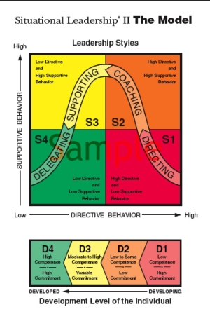
The model is a dramatic simplification of the sophisticated communication styles that an adept leader will use with the members of their team. However, the important things are the adeptness of the leader and the subtleties of their communication and NOT the four quadrant simplification of these.
Again, to convey an iterative process, we may have a flow through the four-quadrants, have many grids superimposed on one another like a three dimensional chess board, or draw a picture of a spiral. It doesn’t matter what the model is, it’s the underlying process that is important.
Have you ever looked in a recipe book? The steps in the recipe are often numbered to make it easier to follow. No cook would imbue significance to the numbers themselves or to the overall number of steps. A recipe for goulash with 6, 7 or 8 steps is still going to produce goulash. However, back in 1939, Alcoholics Anonymous published a book presenting a twelve step process for people to overcome their addiction – not 11 steps or 13 steps, but 12 steps. Since then, these steps have been adapted to suit all kinds of different settings. The idea of “12 steps” has been so widely promoted that it has become a Hoover or a Biro to the addiction world – indeed to the world of change generally. Today, managers seeking to introduce change speak of a programme of so-many steps drawing on the unconscious mental association of 12-steps being something we have all heard of. Thus we get a six-step process to problem solving, an eight-step process for developing spiritual intelligence, ten steps to living gracefully, and so on. There is no profound significance to the number of steps – they simply indicate the degree of simplification that the underlying process could cope with, the mental power of the target audience, and the imagination of the author. They are simply attempting to play an unconscious marketing trick on us.
Carl Jung proposed a model of personality based on four dimensions. His terms were adapted (aka marketed) by the mother and daughter, Myers and Briggs, and now many people in organisations know that they have been pigeon-holed into one of sixteen boxes. The proponents of the model are full of evidence that the entire population of the world can be fitted into one of the sixteen boxes. Mind you that is little different from the 12 star-signs that more of us avidly follow than we’d care to admit.
So, why do we fall for these models so readily? Why don’t we demand to be shown the underlying evidence? Why will we steadfastly refuse to change our thinking in the light of real evidence that the model is wrong? More on that for the next article.
In the meantime, be a little cautious when someone tells you that you are an “amber meme” or an IMA RED, a completer/finisher, an INTP, a Lamborghini, or a dolphin! They may have invested a lot of energy in creating a model that works for them, that helps them make sense of a complex world, but it’s only a communication tool. The model might be based on a solid bank of data or it may depend on a very flimsy platform of real evidence.
Best wishes


